
Oh my God! What font should I choose? (part one)
- Majkí
- Apr 9
- 7 min read


Dneska o bezradnosti z písma.
Když grafický tvůrce neví, jak zvolit písmo?! A vůbec, podle čeho se volí ten správný font?
Picking a font can be such a tricky thing! There are so many things to consider! It's so hard to decide! But don't worry, my friend! We're here to help you put an end to those feelings and make your creative life easier :)
The main goal of this article is to help you feel more confident in your abilities. To help you out, I'm going to introduce you to three handy tools that will help you overcome any uncertainty you might have when choosing a font.
Why do we hesitate about fonts?
There are two main reasons for this.
1) The designer doesn't trust himself or his judgment.
Or.
2) The designer uses a dysfunctional font selection method.
So, let's change up our method of font selection, and we're almost there!
Now, I'll turn it into a fun exercise: let's not type what we want, but monitor what we don't want. I truly believe that most graphic novices can reliably and safely identify which fonts do not match their current intention. Let's do a quick test to see what doesn't match right now. I bet you'll immediately recognize that it doesn't match in the following example.
Alien Test
What do you think? Did I choose the right font? Does this calligraphic font fit the context of the raw and inhospitable planet LV-426?

I'm sure you can see it! The font used for the Aliens inscription "beautifully" doesn't quite go with a space monster, nor with the fearless Sigourney Weaver. Let's talk about it.
I'm sure you'll agree that the font has a certain softness to it, especially when I enlarge it. There's a certain "obesity" in the morphology, you know?
You might have noticed from the beginning that it didn't quite fit together, but now we can name it more precisely. Take a look at what I mean.
The way the letters are arranged together makes a certain kind of visual impression.The stroke of the character brings to mind a certain mood, context, and thematic genre. This soft font doesn't really give us a feeling of chilling danger at the space colonists' base. James Cameron might not be a huge fan of this font.
This is the main lesson graphic designers should keep in mind. The shape of the font can actually convey a certain psychology. It evokes a personal experience, an emotional reaction, and expectations, unintentionally but reliably.
This font would work well in a 100% conflict-free and safe environment. It would probably look good on a box of a children's building set, somewhere in a toy store (oh yes, the manufacturer of board games, Albi, has a very similar font in its logo!).

The second example is not the real nut, that is, the real Alien. Do you see it too? ... Of course you do!

You won't be wrong!
Because you've been looking around.
I truly believe that you have the ability to choose the perfect font because you've been exploring the world for years, taking in all the beauty around you. With your keen eyes, you've already seen so many different contexts and genres. You've actually looked through an enormous graphic database filled with examples of fonts.
We all have a vast inner repository of examples and connections, waiting to be tapped into. Font + context. Font + situation.
Almost everyone has this inner gallery. Even those who don't actively create graphics have it. And you, if you're thinking about the principles of graphics with interest.
Second cocoa test?
Would you like some cocoa? I have three versions of the sign here. Which one would you like to choose? And now, please tell me in your mind why you chose your favorite. Which version would make you want to come in and have a cocoa?


With your permission - I'd love to share my thoughts.
Here's my reflection.
(1st sample) This is, let's say, an intellectual font. By that, I mean a classic book font, perfect for setting long texts. It has soft stroke shading, meaning there's a slight contrast between thin and thick strokes. This font is commonly used in classical literature. But for the Milk Bar, we probably don't need a serif font, which looks quite serious after all.
(2nd sample) This font, Courier, is associated, whether we like it or not, with the typeface on typewriters. If you look closely, you'll notice the serifs have a geometric slanted end, which gives it a more formal and strict feel.
(3rd sample) The last version is more promotional, and it's a purely sign font that's meant to attract attention. It's unique and easy to read from far away. It's almost as if it's a nod to the First Republic, with the middle horizontal axis (where the middle bar E and A leads) being pushed up. For me, it can evoke a sense of history and tradition, reminiscent of the First Republic. The font pairs beautifully with the overall metal structure of the sign. But hey, don't just take my word for it! This is just one option, and I'm excited to see what other amazing solutions you come up with!
I repeat that: You can do it! Because you perceive the context.
your topic, the graphics you're working on, isn't a new one, but that's okay. It's been processed so many times, probably thousands of times! Someone has already solved your topic, and it has its own graphic coat. Someone has already given it a functional graphic coat.
That's great news! It means that you're not starting from scratch. It means you already have navigation and a preview, which is awesome! With that in mind, I'd like to offer one more suggestion to help you along:
Hey, why not do a little research?
If you're comfortable, you're welcome to do a quick 5-minute survey to see how your predecessors handled a similar task (like the one you're currently solving).
If you're feeling shy, don't worry! Don't worry about it. There's no shame in that! It's not a sign of inventive weakness.
It's actually a smart move that can save you time.
In just 5 minutes, you'll discover a whole collection of different solutions, making it easy to find what you like, what's great, what's a dead end, and what to avoid.
In just ten minutes, you'll have a clear idea of the path you want to take.
You'll see if you want to continue in the same spirit (check out the example collection of Sweet Shops) or if you're ready to follow your own path of adventurous originality.


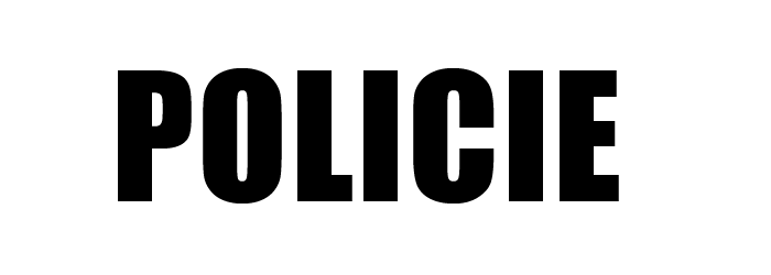
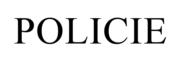
Police car test
As I was saying, there's something called FONT SHAPE that we should talk about. Let's keep that in mind as we do a quick visual test to see how sensitive you are to different types of fonts. What font do you think would be perfect for the new police car? You choose:
A) A rather sans-serif font.
A simple and straightforward font, free from all frills. A font with a robust stroke force — to inspire determination. Or maybe a narrowed character width could inspire order, rhythm, and the definition of the guards?
B) Or maybe you'd prefer a serif and shaded font?
A font with variable stroke thickness (also called "shading") that will give the font flexibility and softness. This font is perfect for making longer texts feel graceful and easy to read.
C) Or maybe a sans-serif font with rounded strokes, like the paws of a teddy bear, to make it look soft and cuddly?
I'm sure you have your preference, just like me.
When choosing a font, it's all about focusing on the structure and construction. The font can evoke so many associations and impressions. So, which design will you choose?

Faux-pas from Portugal
In Porto, Portugal, they use shaded italics on police cars. It's a little unexpected from a typographic point of view, isn't it? And, my, what an interesting detail: on the passenger door, the italics are tilted in reverse! If you look at it as a graphic work, it's like a playful typographical mistake, like a joke that's all in good fun.
In Porto, it's a playful moment of camaraderie, where the crooks and typographic aesthetes (a term I just love!) can have a good laugh at the cops and maybe even slap their knees! This is how you tilt the font to the left!


Who still doesn't believe in themselves?
I'm here to tell you that there are so many great font options out there!
Above all, don't stress (when it comes to choosing the right font). Remember, working with fonts isn't as challenging as solving Sudoku, where mistakes can be tough to bounce back from. There's a perfect font for everyone, and you'll find the one that's right for you!
With fonts, there are many good solutions, so take your time and enjoy the process! In our circle of typographers and graphic designers, we have a freer environment than in the crossword puzzle club.
When it comes to fonts, the possibilities are endless!
Orwell's novel "1984"
What if you were to design a new book cover for George Orwell's novel 1984? What font should you choose?
We've got three handy tools to help you choose the perfect font:
You understand and perceive the genre context of your current project.
We are not lazy to do a 10-minute graphic research and learn from it.
We know there's more than one right solution.
So, let's dive into the world of 1984!
In the past, book editors and designers often chose a strong sans-serif font for this novel, and there's a good reason for that.
Given the genre and mood of Orwell's novel, it's no surprise that you won't find any fragile hairline (thin) cuts among these examples. A political regime with elements of absolute control is simply crushing, like an iron boot, uncompromising, and brutal. That's why we often see blocky, demonstratively striking bold fonts in the examples.


So the following script, written in a playful, quick gesture (with a free, intelligent ease), might not end up on the cover of the novel 1984, maybe not even in the next edition.

Conclusion
Friends, this was just a little introduction to the topic of Which Font to Choose?
I'll be going into more detail about it in a follow-up article, so I'll see you there!
I'm sure you'll find the examples you've come across so far really helpful. It's just a matter of remembering them when you need them.
And just to be thorough, I want to remind you of a couple of things:
The shape of the font will beautifully guide you in the right direction. Just enlarge the font as much as possible until the peculiar psychology of the shape breathes on you.
Your friend in huge labyrint!
At first, the font might seem like a tricky part of the design, but trust me, it's not. Typography and Fonts are great ally for graphic designers. If you give it your full trust and attention, it'll take care of the heavy lifting for you.
Best regards Michal Žižka


Comentarios